
Greenwood v0.15.0
Published: Aug 6, 2021 (postdated)
What's New
We are super excited for this release as it introduces a new feature to Greenwood we are calling "Theme Packs", courtesy of the new Context Plugin type that was also made available. This release also addresses some bug fixes and some refactoring, all of which you can check out in our GitHub release notes.
Theme Packs
Being a developer is a lot of work. Being a designer is also lot of work. Being both is even more work! But if you're a developer without an eye for a design, it can often feel like an insurmountable task to get that article you're writing, or that landing page for a small business, or that little splash of color to your weekend side project to look juuuuusst right. Struggling with aesthetics is the last thing you want in your way when trying to get a good idea out the door.
With Greenwood Theme Packs, now developers and designers can create and share reusable HTML / CSS / JS as npm packages that other Greenwood users can pull into their Greenwood projects as a plugin. Now anyone can get up and running with a fully designed and themed site and all they have to do is just add the content! 🥳
In Practice
For those unfamiliar with CSS Zen Garden, it is a site aimed at showcasing the power of CSS through static HTML.
The HTML remains the same, the only thing that has changed is the external CSS file. Yes, really.
That is really what is at the heart of a Theme Pack, wherein the user of a theme pack only has to provide content, effectively.
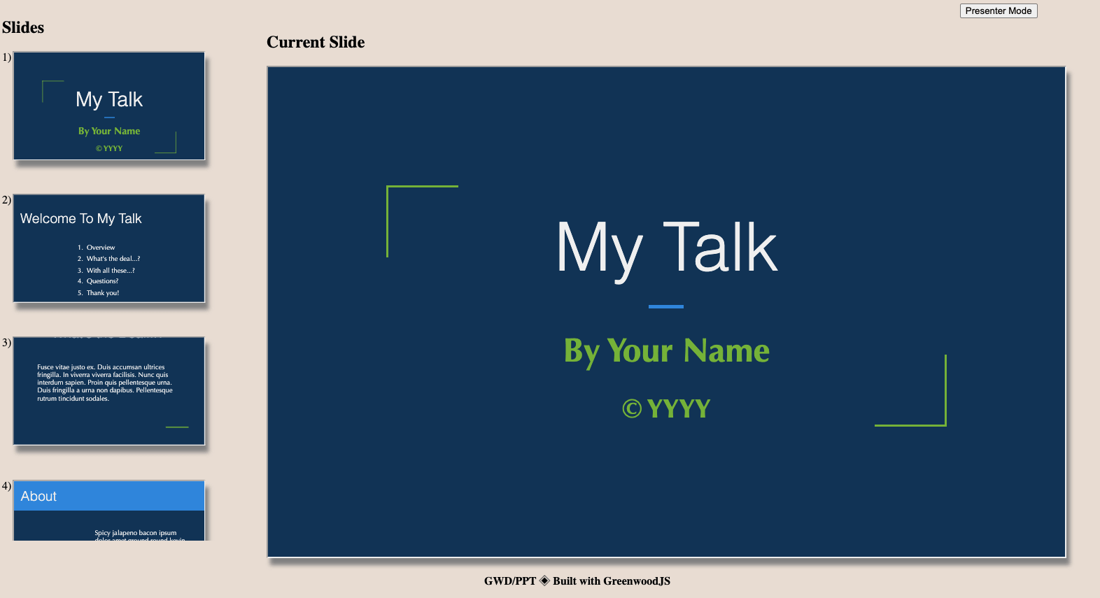
For example, think of a template for a presentation / slide deck. There will generally be the following
- theme (colors, fonts)
- background images and graphic
- slide layouts (title, two column, list)
As HTML, that might look like
<!DOCTYPE html>
<html>

  <head>
    <style>
      :root {
        --color-primary: #135;
        --color-secondary: #74b238;
        --font-family: 'Optima', sans-serif;
        --font-size: 2rem;
        --backgroundUrl: url('../assets/background.jpg');
        width: 99%;
        margin: auto;
      }

      :root h1 {
        background-color: var(--color-secondary);
      }

      :root p {
        color: var(--color-primary);
        padding: 0 2rem;
      }

      :root img {
        float: left;
      }
    </style>
  </head>

  <body>
    <div id="container">
      <content-outlet></content-outlet>
      <hr />
    </div>

    <script> type="module">
      // JavaScript can go here too!
    </script>
  </body>

</html>
For a user of a theme pack, they would just need to provide markdown that matches the template and presto! Instant theming an layout. 💯
# My Slide Title
<style>
/* Overrides and customizations are super easy when it's just HTML and CSS */
:root {
--color-primary: red;
--font-family: 'Comic Sans', sans-serif;
--backgroundUrl: url('../assets/rick-roll.gif');
}
</style>
With my own slide content.

Learn More
We're excited to see how this feature allows for greater collaboration across the web and those with design skills can help those of us still working on ours look good. Theme Packs are powerful, and can encompass a full application framework as demonstrated in this presentation template repo, and you can see this example of an end user experience of a theme pack used for a presentation I gave.
To learn about Theme Pack development, check out our guide.
Thanks and make sure to share what you've made and we can all learn and grow together! 👋