
Component and Styles
So now that we've made some content for your site, I think we can agree it's not quite all "there" yet and could benefit from a little styling and branding.
In this section, we will add the following to your project:
- Header / Footer - These provide a great case for creating some reusable components with Custom Elements, we can create self contained reusable components for our site.
- Styles - Of course we want things to look nice too! We'll add some CSS to help hang things in just right the place.
Templating
For this guide, we'll use a "vanilla" custom element for our footer.
Start by creating a file called src/components/footer.js with the following code in it.
class FooterComponent extends HTMLElement {
// run some code to set HTML when the component is ready
connectedCallback() {
this.innerHTML = this.getTemplate();
}
// create templates that interpolate variables and HTML!
getTemplate() {
const year = new Date().getFullYear();
return `
<style>
/* CSS will go here */
</style>
<footer>
<h4>My Blog ©${year}</h4>
</footer>
`;
}
}
customElements.define('app-footer', FooterComponent);
Now we can use it in our app template by:
- Referencing our component file via a
<script>tag with thetype="module"attribute - Using our custom element's tag name of
<app-footer>in our<body>
<html>

  <head>
    <script type="module" src="/components/footer.js"></script>
  </head>

  <body>
    <page-outlet></page-outlet>

    <app-footer></app-footer>
  </body>

</html>
Now you can do the same for an <app-header>. See the companion repo for a complete working example. Voila! All our pages now have a header and footer! 🎉
You can find more information about component models and Greenwood here.
CSS
OK, so we've made some content and some custom elements, but what about the look and feel? Yes, of course, let's add some CSS!
For global styles like Google fonts, Bootstrap, background colors, or browser resets, let's create a file called src/styles/theme.css that we can reference in all our layouts.
Here are some styles you can add to your site to snap things into place a little bit.
/* theme.css */
* {
  margin: 0;
  padding: 0;
}

body {
  font-family: 'Source Sans Pro', sans-serif;
  color: #020202;
}
Now we can <link> this CSS file into our layout. Easy! 💥
<html>

  <head>
    <link rel="preconnect" href="https://fonts.gstatic.com">
    <link rel="stylesheet" href="//fonts.googleapis.com/css2?family=Source+Sans+Pro&display=swap">
    <link rel="stylesheet" href="/styles/theme.css">
    <script type="module" src="/components/footer.js"></script>
  </head>

  <body>
    <content-outlet></content-outlet>

    <app-footer></app-footer>
  </body>

</html>
Within our components, we can easily add some styles right within the component definition itself. For example in our header component, we can style it like this and take advantage of Shadow DOM.
class FooterComponent extends HTMLElement {
connectedCallback() {
this.innerHTML = this.getTemplate();
}
getTemplate() {
return `
<style>
footer {
color: blue;
}
</style>
<footer>
<h4>My Blog ©${year}</h4>
</footer>
`;
}
}
customElements.define('app-footer', FooterComponent);
Taking this all the way with the code from companion repo, you should be able to get a result that looks like this:
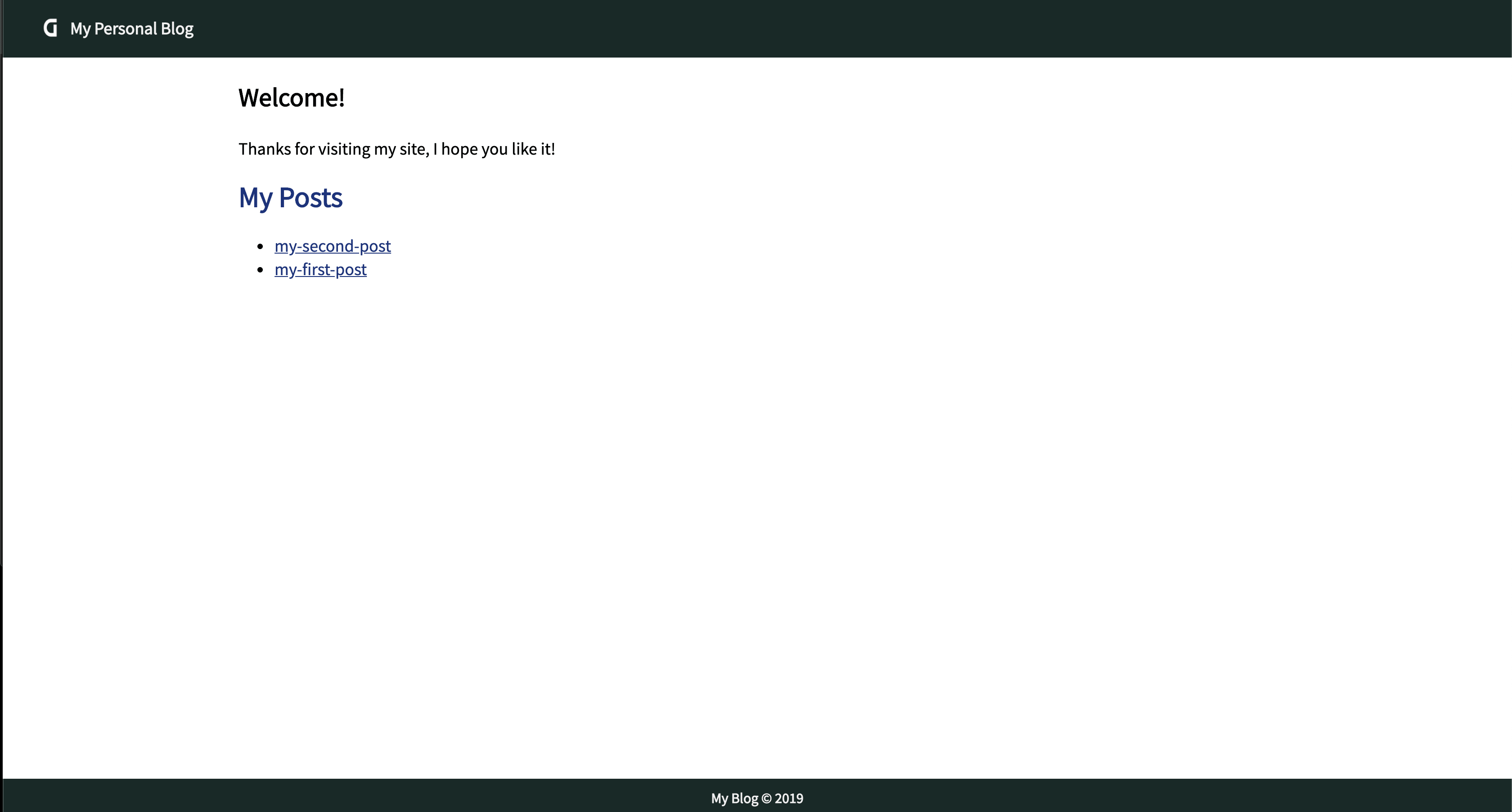
Phew!! What a journey, but now you have a blog ready to publish! The last step is to build and host your project, so let's move on to the build and deploy section and make it happen!